

The beauty of being a designer is that it offers a chance to add creativity to things that are otherwise just a drag. That certainly describes 404 pages, the pages that come up when you hit a bump on the internet. These pages are placeholders designed to inform the user that their surfing session has been derailed for whatever reason, be it typing in a bad URL or clicking on a bad link.
Nobody wants to come across a 404 page. They are the online equivalent of taking a wrong turn. No one ever says, “Oh great, I surfed onto a 404!,” just as no one ever says, “Terrific, I just took a right when I should have gone left!”
However, making a fun and amusing 404 page can turn the entire experience around. When you present your visitor with someathing unexpected, whether it’s a page with a joke or a great picture or a quippy note, you’ll elicit a smile or maybe even a laugh, turning a bad situation into something tolerable. While no one will ever want to land on a 404, a great design will ease their frustration.
Here are 10 examples of outstanding 404 pages to emulate and draw inspiration from.
- Hootsuite
Hootsuite, a social media tool that allows you to compile all your streams into one screen, makes a fun play on pictures and words for its 404 page. Visitors who stumble onto the 404 are greeted by a graphic of a milk jug with the Hootsuite owl’s picture on it below the words “missing” and a short description. The header on the page welcomes the visitor with the words “404 Fowl Not Found.”
Why it works: The missing kid milk jug is widely recognizable and a perfect visual cue for a 404 foul-up.
2. iStockPhoto
The 404 page for iStockPhoto, Getty Images’ stock photo site, is whimsical, depicting a mouse flying in an airplane on one side and a cat hanging on for dear life high in the sky on the right side. The words “Hang in There” go across the top, and the cat is hanging on the final e.
Why it works: The visuals are cute without being cloying, and “hang in there” is just the right message when you’ve missed something you want to find.
3. Lego
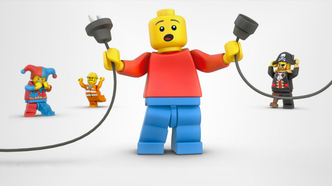
Is there anything Lego does that is not awesome? Its 404 page incorporates minifigs into a cute story-telling tableaux, showing one at the forefront who’s holding a plug that appears to have come undone, giving the impression that he accidentally pulled out the plug and caused your surfing mishap.
Why it works: Anytime you can employ something that you sell to tell a story, it’s a great idea.
4. 12 Keys Rehab
12 Keys Rehab, a drug and alcohol rehab center, turns its 404 page into a resource center. It opens with an apology — “We’re sorry, we can’t find the page you’re looking for” — and then offers a list of topics that might be of interest to the surfer, with links to those pages. It essentially turns a blunder into an opportunity to explore something of greater interest, and it uses lots of visually interesting photos to draw surfers attention.
Why it works: You don’t want people having to hit the “back” arrow to try to find the place they wanted to go. It’s smart to offer up another chance to get their navigation on track.
5. GitHub
Is there ever a bad time for a “Star Wars” Joke? GitHub, a software collaboration, review and code management site, thinks not. Its 404 page plays off the scene in “Star” when Stormtroopers approach Obi Wan and Luke and think they’ve found the droids they’ve been searching for. Obi Wan pulls a Jedi mind trick and convinces them, “These are not the droids you’re looking for.” GitHub’s 404 features a creature in a Jedi-like robe standing near Luke’s speeder with the words “This is not the web page you are looking for.”
Why it works: Not only is it a clever visual, but below, the designer offers a place to search GitHub for what you do want to find.
6. Home Star Runner
If you’re not afraid to get cheeky, check out this 404 from Home Star Runner, a game and cartoon site, a hand-drawn 404 that appears to be written on notebook paper. It starts out with the admonition, “Boy, you sure are stupid,” and gets edgier from there.
Why it works: This approach won’t work for every site; but for young, hip companies, it can be a funny way illustrate the frustration of a 404.
7. Empire Cat
Empire Cat, which offers new and used equipment for rent, has a 404 page that’s laid out neatly and succinctly, and it has a friendly air about it, starting with the simple language: “Uh oh, we’ve lost that page!” From there, the page gives a list of menu options where surfers can try to restart their quest for information.
Why it works: Because it’s helpful. Even the most creative of pages won’t work if they don’t offer a solution to the problem right along with the humor.
8. Apartment Home Living
Apartment Home Living, a site for apartment seekers, has one of the most visually arresting 404 pages you’ll find. There’s a picture of a luxurious bathroom, and at first it appears a sheep is sitting on the toilet. But as you look at the page, the sheep fades away till you can no longer see it. Next to it are the words, “Oops! This is awkward. You’re looking for something that doesn’t actually exist …”
Why it works: The page takes a concept and translates it into the perfect visual interpretation, with some absurdity mixed in.
Now that you’ve seen the best, it’s time to get creative. Challenge yourself to come up with something just as ingenious as these pages for your next 404.
